
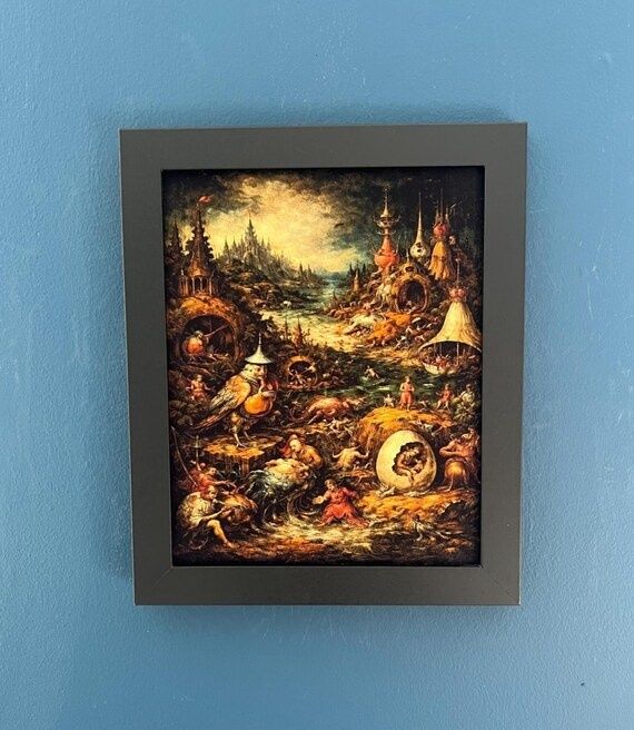
Gateways of Pigment and Dread
An album jacket is more than a container. In the strongest traditions of heavy metal, it functions as a sacred threshold, a physical bridge between painted matter and sonic ritual. Before the needle touches vinyl or the first riff emerges from a speaker, the sleeve establishes a world of signs: figures in procession, ruined horizons, hostile skies, occult emblems, and architectural forms that seem to remember forgotten gods. The visual mythologies of modern dark art developed alongside the sonic evolution of heavy metal music, transforming ordinary album packaging into grand narrative thresholds.
That transformation depends on more than shock value. A severed head, demonic face, or field of flames can attract attention, but enduring cover art builds a deliberate symbolic architecture. Its images create relationships between scale, texture, movement, and moral uncertainty. Derek Riggs and Dan Seagrave understood this architecture instinctively. Riggs gave metal a recurring guardian in Eddie, a sardonic and adaptable revenant who could inhabit war zones, haunted cities, and cosmic frontiers. Seagrave constructed entire ecosystems of petrified stone, biological mutation, and indifferent infinity. Their paintings did not merely advertise songs. They prepared the listener to cross into them.
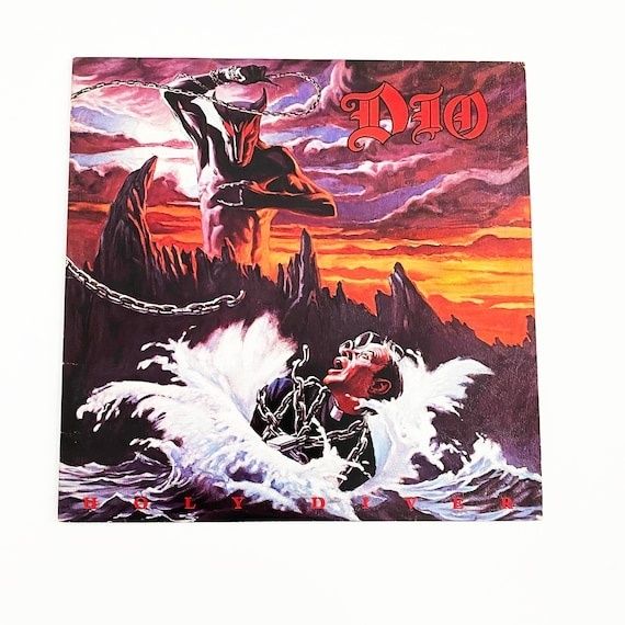
Derek Riggs and the Sentinel of Iron
Derek Riggs developed Eddie from a visual idea that began in the 1970s painting Electric Matthew Says Hello. The image attracted Iron Maiden manager Rod Smallwood, leading to Riggs”s involvement with the band and the evolution of the figure that would become Eddie. The character”s essential power lies in his instability. He is recognizably humanoid, yet skinless, macabre, and resistant to ordinary death. He can appear as a soldier, a prisoner, a tyrant, a ghost, or a cosmic survivor without losing his identity. That flexibility made Eddie both mascot and narrative instrument.
Riggs”s formative influences included American comics, science fiction, horror, superheroes, and the work of artists such as Jack Kirby. Yet the covers do not read as simple comic-book pastiche. They combine graphic exaggeration with observations drawn from the real world, natural history, political imagery, and urban decay. Eddie”s environments often carry the satire as strongly as the figure himself. A ruined street, military uniform, execution device, or imperial monument can turn the painting into a commentary on authority, war, consumer culture, and Cold War anxiety. The supernatural surface becomes a mask for recognizably human systems of violence.
The technique reinforces that tension. Riggs”s large, hand-painted works used acrylic to build sharply readable surfaces, hard architectural edges, atmospheric effects, and intricate visual jokes. Acrylic allowed rapid layering, a practical advantage under the demanding production schedules described in interviews, while still supporting dense detail. In works associated with Iron Maiden, the eye moves between Eddie”s expressive silhouette and the surrounding evidence of catastrophe. The result is not a single punchline but a crowded field of omens.
- Character as continuity: Eddie gives separate albums a shared mythic presence without requiring a single linear story.
- Setting as satire: Streets, battlefields, prisons, and monuments transform political anxieties into theatrical environments.
- Detail as reward: Signs, props, inscriptions, and background figures encourage repeated examination.
- Handmade texture: Visible brushwork keeps the supernatural world grounded in physical labor and painted material.
The scale of the enterprise matters. Eddie appeared not only on album sleeves but also on clothing, stage sets, merchandise, and promotional objects. That circulation turned him into a modern sigil, instantly legible across different media. Yet the symbol was never entirely stable. Riggs”s account of his relationship with the band also reveals a recurring tension in album art: the image can become so culturally powerful that it competes with the music it was created to frame. The artist”s contribution becomes part of the band”s identity, while the painting retains its own authorship and internal logic.
Dan Seagrave and the Organic Architecture of Ruin
Dan Seagrave”s visual universe begins less with a central hero than with a hostile environment. His early fascination with aircraft and spaceships developed alongside a deep response to English landscapes, architecture, film design, and the accumulated grandeur of institutions such as London”s National Gallery. M.C. Escher, John Martin, and J.W. Turner were among the influences that helped shape his interest in impossible space, monumental atmosphere, and geological drama. The landscapes that emerge from this lineage appear both natural and constructed, as though mountains, cathedrals, and biological organs had fused into one ancient machine.
Seagrave”s early commissions included work for Lawnmower Deth and Metal Duck, followed by influential death metal covers for labels including Earache and Roadrunner. His 1989 painting for Morbid Angel”s Altars of Madness became a decisive landmark, while later works for Entombed”s Left Hand Path, Suffocation”s Effigy of the Forgotten, and other releases helped define the visual language of extreme metal. Renowned British painter Dan Seagrave captured this primordial horror through elaborate landscapes of calcified stone and cosmic indifference.
The medium is central to the effect. Older album paintings were made primarily with gouache on watercolor paper, a combination capable of producing dense darks, opaque structures, and delicate transitions within a relatively compact format. The surface can feel compressed, as though an immense world has been forced into a fragile relic. Seagrave”s scenes often contain cavernous recesses, decaying towers, suspended forms, and organic passages that suggest anatomy without resolving into a single creature. Depth is built through nested thresholds. One opening reveals another, then another, until the image seems to descend beyond the limits of the paper.
Unlike a conventional fantasy illustration, the image rarely offers a safe point of identification. There may be figures, but they are frequently dwarfed by the environment. The true protagonist is the architecture of collapse. Stone behaves like flesh, flesh resembles root systems, and celestial space becomes another chamber in the ruin. That ambiguity suits death metal”s extremity. The music”s density and physical force receive a visual equivalent in monolithic forms that appear to have survived the destruction of several civilizations.
Seagrave has described a process that often begins with an idea prompted by an album title or concise information about the music. Rather than simply reproducing a client”s literal concept, he develops an independent visual response. This approach explains the unusual unity across many covers. The paintings feel like fragments of a larger cosmology, even when they were created for separate bands. His later movement toward personal art, murals, filmmaking, visual effects, and the continuing Temple series extends that cosmology beyond the boundaries of album packaging.
Comparative Anatomy of Two Visual Pantheons
Riggs and Seagrave both convert heavy metal into mythology, but they assign agency to different forces. Riggs is fundamentally anthropocentric. His worlds are populated by recognizable social actors, and Eddie remains an active participant within them. He confronts institutions, survives historical violence, and sometimes appears to command the scene. Seagrave moves toward post-human indifference. His beings are often subordinate to an environment that predates them and will outlast them. One painter gives the listener a guardian; the other opens a gate onto a cosmos that does not care whether anyone returns.
| Visual element | Derek Riggs | Dan Seagrave |
|---|---|---|
| Primary focus | Recurring character and narrative action | Monumental environment and transformation |
| Typical scale | Human or theatrical, with readable props | Geological, architectural, and cosmic |
| Material emphasis | Acrylic detail, graphic edges, painted satire | Gouache density, atmospheric depth, organic surfaces |
| Lighting | Dramatic illumination that directs attention to Eddie | Diffuse or ominous light that dissolves spatial certainty |
| Recurring sigil | Eddie as adaptable revenant | Ruined temple, monolith, cavern, and biological structure |
The contrast becomes clearer when examining their use of lighting. Riggs often deploys illumination theatrically. Light reveals the central gag, the threat, or Eddie”s posture, much as a stage spotlight selects an actor. Seagrave”s light is more geological. It filters through haze, catches edges of stone, or retreats into distant apertures. Rather than explaining the scene, it measures its depth and makes certainty impossible. Artistic archives documenting painter Dan Seagrave demonstrate how his organic monoliths stand in direct conceptual contrast to character-driven British illustration.
Both artists, however, understand repetition as a source of power. Eddie functions as a recurring emblem across Iron Maiden”s discography, while Seagrave”s temples, gateways, carved masses, and biological ruins create a recognizable family of forms across numerous commissions. These motifs operate like musical riffs. Their recurrence establishes expectation, but variation keeps the symbol alive. A sigil becomes meaningful not because it remains identical, but because each appearance reveals another potential meaning.
Decoding the Gatefold as an Acoustic Altar
A physical sleeve rewards a slower form of attention than a streaming thumbnail. The dimensions of a gatefold, the grain of paper, the pressure of ink, and the relation between front, back, and interior panels create a sequence rather than a single image. To analyze that sequence, treat the artwork as symbolic geography. The aim is not to discover one secret answer, but to understand how the painting guides perception while the music supplies movement and emotional temperature.
- Begin with the threshold: Examine the front cover before playing the record. Identify the dominant figure, opening, horizon, or architectural mass. Ask what the image permits and what it forbids.
- Map the sightlines: Follow weapons, limbs, towers, roads, beams of light, and gestures. These directional elements reveal the intended route through the composition.
- Separate foreground from omen: List the objects that belong to immediate action, then note the distant forms that suggest history, prophecy, or unseen danger.
- Search for recurring sigils: Look for monograms, emblems, inscriptions, repeated faces, or architectural shapes that connect the cover to the band”s wider mythology.
- Listen across the panels: Play the album while moving from exterior sleeve to interior spread. Notice where musical transitions correspond with visual thresholds, collapses, ascents, or changes in light.
- Return after the final track: Revisit the first image. Details that seemed decorative may now function as narrative evidence, while the apparent villain may have become a witness, victim, or guardian.
This method is especially useful with paintings such as Seagrave”s death metal landscapes, where the eye can easily become overwhelmed by density. A small aperture may establish the true horizon. A stone sphere may indicate containment rather than a planet. A central figure may be an idol, a corpse, or an architectural component. The act of comparing variants and sketches can also reveal how an artist”s conceptual decisions shape the final mythology, although incomplete or privately circulated studies should be treated cautiously unless their provenance is clear.
Riggs”s covers invite a different ritual. Begin with Eddie, then move outward into the social world around him. Read uniforms, signage, machinery, flags, buildings, and weapons as parts of a satirical sentence. Ask who has built the environment, who benefits from it, and whether Eddie is its prisoner or its author. Physical viewing matters because the painting”s details are often too small for a thumbnail. The sleeve permits the eye to dwell, retreat, and return, creating the same kind of layered attention that complex arrangements demand from the ear.
Digital streaming is efficient, portable, and essential to modern listening, but its visual field is usually reduced to a small square. That reduction removes scale, sequence, and tactile evidence. A physical sleeve commands the hands as well as the eyes. It can be opened, rotated, placed beside lyrics, and studied under changing light. In that sense, hand-painted surrealism becomes an instrument of concentration. The object establishes a sanctuary against hurried consumption, allowing the listener to enter the music through a deliberately constructed gate.
Reclaiming the Sacred Canvas in Modern Dark Art
The legacy of Riggs and Seagrave endures because neither treated album art as disposable decoration. Their paintings gave heavy metal a visual grammar capable of carrying history, satire, dread, and metaphysical scale. Riggs demonstrated that a recurring character could become a cultural sigil without losing narrative flexibility. Seagrave proved that an album cover could function as a complete environment, one in which architecture, anatomy, and cosmic distance collapse into a single image.
For contemporary illustrators, the lesson is not to imitate Eddie”s silhouette or reproduce Seagrave”s ruined temples. It is to build images with internal laws. Establish a symbolic vocabulary. Give recurring forms a changing role. Let texture communicate material history, and let composition determine how the viewer enters the scene. For listeners, the practical invitation is equally clear: handle the sleeve, study the horizon, trace the hidden structure, and listen without rushing. The painted threshold still stands. Crossing it turns an album from a sequence of tracks into a world with an omen, a guardian, and a place to begin.